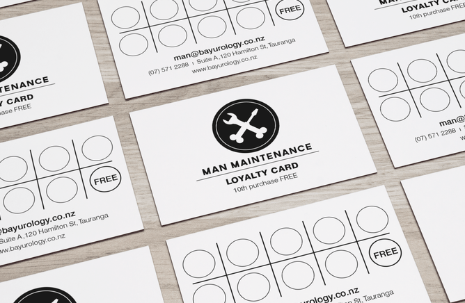
The Logo Design Process: Man Maintenance
Man Maintenance at Bay Urology
I was briefed about the erectile dysfunction clinic at Bay Urology (Tauranga, NZ) and spent some time thinking about how to convey this one. The name of the clinic took a while to be decided upon, but once Liam let me know it was “Man Maintenance” I was thrilled to see a bit of humour come through in what is surely a low moment in anyone’s life when they need to attend an erectile dysfunction clinic.
So many ideas came to me but most overpowering was the toolbox analogy and all the tools. Screw, spanner in the works, hammer and tongs… My idea was to have stylised testicles at the bottom of the screwdriver and spanner, which initially could be overlooked. This logo is not to be obvious to all, but meaningful to some, with a touch of humour to all who ‘get it’. The subtle humour makes it likeable, acceptable, recognisable and (almost) cool and hopefully it gets a better “pick up” rate than an “Erectile Dysfunction” card.
For the business card, we went for a gloss varnish on matt laminate with a totally black
front of the card (only the words “MAN MAINTENANCE” in white) with the logo as a clear, gloss varnish ie. one needs to catch it in a certain light to distinguish the circular logo. The gloss varnish “aha” moment requires a bit of extra attention to register the tools.
Interestingly, some people see the testicles as bones (as in skull and crossbones) and therefore perceive it in a more threatening light (death) but that too is OK, in my opinion, because it’s important to take care of all the tools in the box - prevention is after all better than a cure.
If the need arose (it did for an advertisement) to be more subtle with the logo in print, we used it cropped, so the balls were hidden, but the meaning still clear. This time with a tagline: Discreet. Effective. Affordable.
Importantly we’ve made a very sensitive subject a little appealing and little stylish, keeping it masculine and discreet, with a touch of a smile, hopefully.


